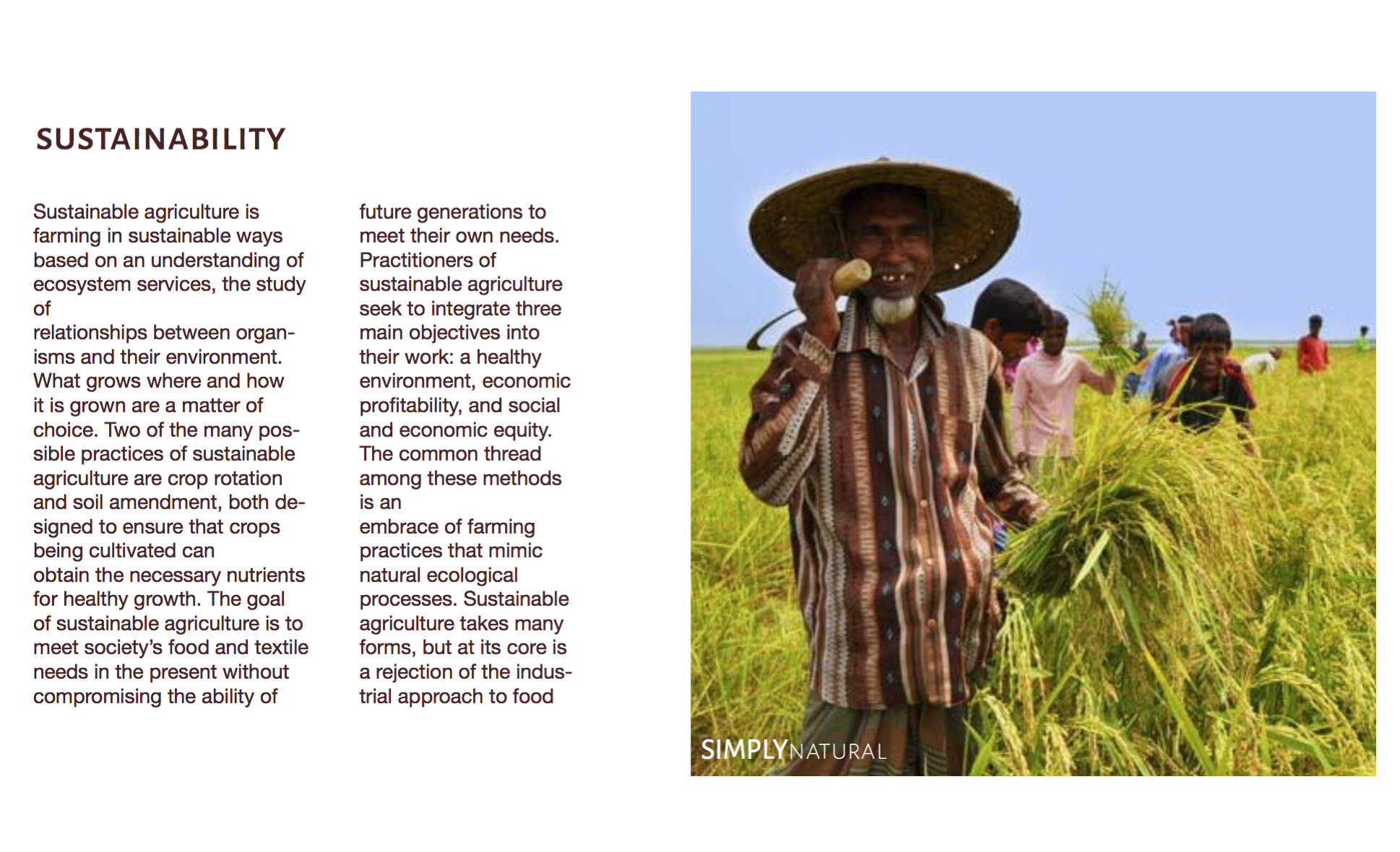
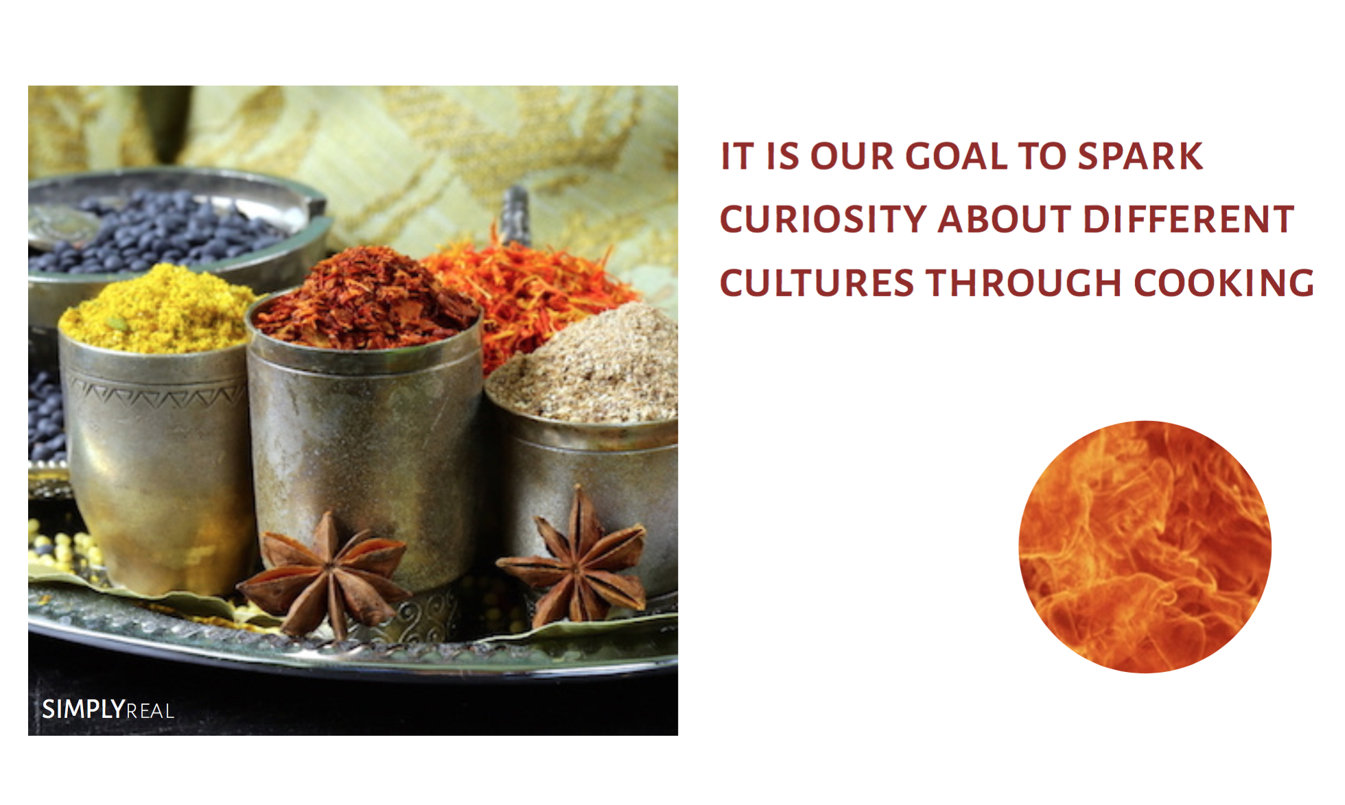
The Peruvian textile industry is world-renowned for its fine quality and natural elegance. Combining the curiosity for the culture of my ancestors and my interest in fashion, I discovered ancient and modern meanings found in the makings of a material that defines the nation: the alpaca fiber.
Borrowing from the color theories of Josef Albers, who explains the principles of color relativity, intensity, and vibrating boundaries, I sought to rebrand Mirasol by capturing the attention of the client with a fluid color gradient and large letters. Their yarn is made from the animals bred by these communities for generations in the highlands. During my visit, they spoke about wanting to make Mirasol’s image more inviting with vibrant colors.
After I finished coding the screensaver, I made it come to life by using a projector. This process was exciting because I was able to see how it looked in different sceneries. First I tried it out by projecting it on a wall of leaves in the garden. It was interesting to see how it looked so big in real life, and it was hyponotizing in a way. i thought there was more movement needed and I wanted to project it in a pool. This would be showing real water and having the pattern of fake water on top of it. I then projected it on curtains and had them moving with a fan from behind.
My made up company is called The Water Project. Our mission is to help end the water crisis and restore hope one community at a time. The message is that you can be the bridge between the clean and dirty water by buying a certain type of fosset. With the money from selling the fossets, the company helps fund and support The Water Project. The composition of the posters is split in the middle. The text is set centered on top and also split in the middle, mimicking the composition behind it. My goal for these ads was to make them simple and easy to understand. The composition used gives the posters a together feeling.